Wednesday 4th May 2011
The final project was introduced today. I have been reading the brief and trying to decide what subject to do it on. This morning we did research on the companies we are going to produce a piece of work for. I looked at The Soundhouse, a live music venue in Bolton (http://www.thesoundhouse.co.uk/) so that I could take photographs of bands doing gigs and design posters for them. I also considered a public house in Bolton named the Alma Inn, as they are also well known for punk rock bands doing gigs there. Photography and creating a magazine are a couple of my other options.
I have decided to take photographs of my client Emma Leivesley and her band for a photo-shoot. The reason I chose to do this is because bands have lots of opportunities within the media such as photography, videos, posters, websites, leaflets, badges and t-shirts. Therefore, if I took photographs and put them in a brochure, I could also create a design for a t-shirt and a poster to show that I am flexible.
In order for our project to go ahead we have to understand different types of data. Primary data is first hand research; this means you create it personally. For example, questionnaires, focus groups and interviews are all types of primary data. Secondary is slightly different, it is data that has already been found by somebody else. Examples of this are looking through the Internet, journals and magazines.
Quantitative research is to do with numbers. Closed or restricted questions lead to this type of data. It can be easily processed. Because of this and it the questioning takes a small amount if time, a large amount of people will participate in the group.
On the other hand qualitative data gives more literate information than numbered. Asking people open ended questions (questions which do not include a tick box for any answer) allows us to get more detailed answers and find out peoples true feeing about something
It is extremely important that research is carried in order to find out what things your client likes, and colours or certain logos. If research isn’t done the client might decide they di not like what you have produced. You need to know about a product and what the client wants before you can produce it. Example of television advertisements where bad research was done on the company/situation was a McDonalds advert in which the voice over tells the audience about products for £1. He mentions lots of different types of currency equivalent to an English pound, but says a ‘bob’, which isn’t equivalent to a pound leading to complaints by viewers. Another was a FRANK advert, which included Pablo the talking dog trying to stop people from taking drugs. This advert got complaints about it as the advertisement was aimed at 18-25 years olds and many people said that a ‘talking dog’ would not discourage adults to stop taking drugs. (http://www.youtube.com/watch?v=4LnA-xCz5U8)
In the afternoon the class were put into groups and had to devise a survey for people to answer in and out of college. The survey was to find out what people use the Internet for the most and whether they use on demand as the number of downloads since the past year had dropped. We asked the age and gender of participants as we wanted to find out what type of people download and what type of people don’t. We also asked whether they watch television, how much television they watch, if they use social networking sites and on demand, and which category they use the Internet for the most.
Thursday 5th May 2011
Today we were shown a presentation about design briefs, as we have to have a design brief in our Final Major Project in order to understand what work our client wants. A design brief is a piece of communication, not necessarily a written paper document but can be a video or a web visual etc.
A design brief consists of a purpose, which tells you why the client wants the job doing, a background, this is of the company and the product, an Audience, which the product will be aimed at, and objectives. It also includes the task, which is what you are to create, deadlines, when you are to create it for, and special issues and contacts. The task is the most important part as it is what is expected of you, if this isn’t carried out correctly following the brief, the client will not pay you as what he/she wants is stated on the brief. Contact is also a very important part because if you do not have the clients contact number or name and you are not clear about something or you need to get in contact with them, you would not be able to, causing wasted time.
A good brief would help you produce a satisfactory and effective solution for the client and also a smooth and hassle-free workflow.
A bad brief can result in artefacts that do not meet the clients requirements therefore leading to the project going over budget, delays to deadlines, increase in the cost of the project and the client will not use you as a practitioner again. The wrong people giving approval of your brief can also lead to bad or unpaid work.
In the afternoon we looked at Photoshop sketching using the graphics tablets. We each found a photograph from the internet which related to our final major project or our photography work ‘graphics for print’ so that we could trace them. I chose a photo of Taylor Momsen (the lead singer from the band ‘the pretty reckless’) because for my final major project I will be photographing a band. I open the image in Photoshop, added a new layer which I painted white and turned the opacity to 50%. This was so I could see the actual photo and trace over it on another layer I named ‘draw’ but without drawing on the actual photo layer, it acted as my tracing paper. I drew the outline of her face and any other things in the photograph with the pen tool, I used the colour black. After I had done this I added colour to the picture. As some parts of the coloured parts didn’t look very realistic I used the dodge (makes colour lighter), burn (makes colour darker), smudge and blur tools in order to make the colours softer and less cartoony.
This was the photograph before I edited it:

Here is the photo afterwards:

I decided to edit the photo in this way as i like the style, it almost looks like a cartoon but at the same time most people, who know about Taylor, should be able to figure out who the girl in the image is.
I also did another Photoshop sketch of a guitar as it links in with my theme of a band. However, this one wasn't as good as the edges weren't smooth.


We created a survey in order to find out what type of media people use the most. This is the powerpoint presentation, I had to present, of my findings:
Wednesday 11th May 2011
Today I sketched a picture of one of the band members (from a previous photograph) as we have to show our drawing skills for our project. After I had drawn the image, I scanned it into Photoshop and started to colour it in with the paintbrush tool. This is the original photograph of 'The Captain':

This is my sketch of the band member:

This is my final picture of the Captain:

Thursday 12th May 2011
I received the design brief for my project today.
The main things I need to do are; take 6 individual photographs of each band member; take a photograph of the band as a whole; and to design a poster incorporating the band logo which should include photographs of all band members and the URL's to each of their social networking sites.
I am happy with what I have been given to do as making posters is probably one of my stronger points within the media sector and I enjoy taking photographs.
The poster should be printed on A3 paper and saved as an editable PDF and the photos I take should be given to my client on a CD and saved as JPEGS.
The Photographs I take will be high quality photographs and will reflect each of the band members personalities, together with a style of their music. Their current colour scheme is Black, White, Orange and Blue.

I am pleased with this design brief as i enjoy taking photographs and editing them, i also like to create posters and doing this is one of my stronger points in the media sector.
18th/19th/25th May 2011
Today I have been carrying out research on Organised Babble and many other bands that they like and that their audience like, these include Arcade Fire, The Stranglers and Pink Floyd. I have also been looking at the settings I should use when taking portrait Photographs of bands.
Research
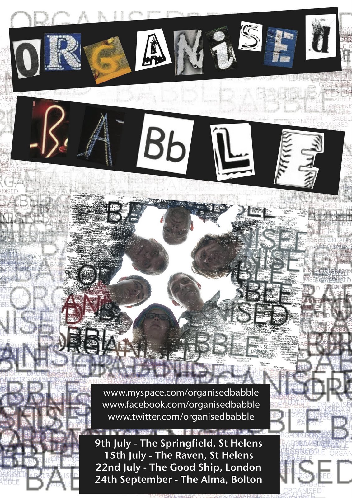
The Band I will be taking Photographs of for my Final Major Project are named ‘Organised Babble’. The band consists of 6 members, five being male and one female, each from the north west of England. The members age ranges from 28 to 46, most of them being in their 30’s. They finalised the line up in 2010.
Their style of music is 2-tone ska; 2-tone is a music genre that has elements of ska, punk rock, rocksteady, new wave and reggae fused together, and Ska is a music genre that originated in Jamaica in the 1950’s and had elements of American jazz, Caribbean mento and rhythm and blues.
The band are influenced by bands such as The stranglers, Arcade Fire and Pink Floyd, each band member is an experienced musician, come from a different musical background and each have their own individual look/style. Their website is http://www.sonicbids.com/epk/epk.aspx?epk_id=314123 and they have many social networking sites, on which free tunes are available. These are: www.myspace.com/organisedbabble
Most of Organised Babbles fans are between the ages 25 and 40 and even though there are near enough the same amount of male and female fans, it just slightly leans towards males.
The majority of their fans are from Britain, particularly the North West of England, however, they have had a fair amount of airplay on US based radio stations.
The Band Members

This is Buz, he plays bass and provides the backing vocals. I think this photograph was fairly well taken; however the background is not clear and the crease where the wall meets is visible.

This is Damo (percussion). The background in this photograph is much clearer that the previous one but the facial expression is not clear. Maybe next time, his full face could be shown.

This is Em P. Free, she plays drums. I like the fact that she is facing the camera but looking away. All the others have their heads and eyes facing away from the camera but this photograph looks much better and more interesting.

This is Kev, he plays guitar. This photo is good but again, the corner of the wall in the background is visible.

This is Roy Dynamite, he plays guitar and is the lead vocalist of the band. Overall this is the best shot from the whole band. The background is clear, most of his face is visible even though he is tuning to the right slightly and his facial expression is clear. This is a good photograph.

This is The Captain, he plays keyboard. This is a good shot. The face is clear and the expression. The only bad thing about the photo is that the background, like the others is not clear.
Overall, I like the black and white effect of the photographs and the fact that they are looking away from the camera. However, the background makes them look slightly unprofessional.
When I take photographs of them, I will take some in colour and some in black and white to see which one looks the most professional and which one the band like the most. I will also take some of them all together rather than just individual portraits.
This is their Logo:

This is a photograph from when the band played live. It is quite a good photo as it can be difficult to get the correct shot when the members are constantly moving. However, there are quite a lot of distractions in the background and the microphone and singers hand is hiding most of his face.

This photo would have been really good if it wasn’t in black and white. I think the colour makes it too dark, as the room was probably dark to begin with. The keyboard is also covering the band member’s body up.

I like this photograph; you can clearly see the guitarists face, as I like the fact that the instrument he plays is fully visible. I think this is the best live photograph.

This photo is good. I like the brightness of the image as you can see all of the person in it (Em P. Free) and the instrument she plays s fully visible. The only thing that makes this picture look slightly unprofessional is that you can see a little bit of someone’s guitar and someone else’s arm.

Bands that have inspired Organised Babble include Pink Floyd, XTC, The Stranglers, The Doors, Frank Zappa, Faith No More and Arcade Fire. I found some portraits and posters of these that inspired me and gave me some ideas for the photo shoot.
Pink Floyd


I like the use of the bench below and the instruments above, they bring more character to the photographs.

The poster below is by Dennis Loren.

I really like this poster! It is by Jacob Philpott. The letters have images of the band Pink Floyd's Album covers from 1967, I love the idea of this.

XTC


I think this photo (below) is the best of the four I have chosen of XTC. Because the bands expressions are clear and I like the colour setting. However, I do like the photo above as the band members have their instruments.

This photograph gives off a different feel to the viewers as it is in colour unlike the others I have chosen, there is a white background instead of a natural one and all the members are standing up.

This poster varies from most of the other band posters I have chosen as the band members are drawn instead of having a photograph of them. I like the colour scheme and the style of the image.

The Stranglers

The photograph above has an effect of an actual old photograph that has faded a little. The facial expressions are clear. I love the theme of the photograph below! Instead of having a portrait taken inside with a white background or sat on a sofa, they have thought around the box and put something different into their photo.

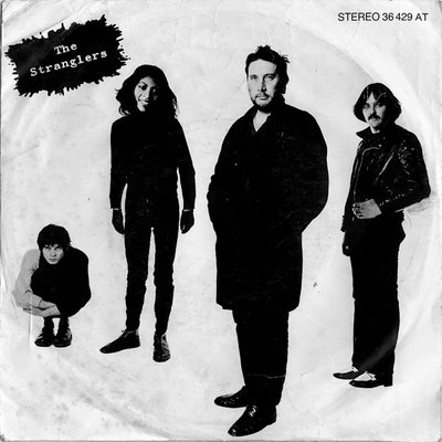
This poster is bright and colourful. I like the style of it, however, one of the members of the band is moving so is slightly blurry. I am not sure if this was intentional or not. I looked at other Stranglers posters and noticed a pattern of the colours, they are nearly all in yellow, black and red. This must be their colour scheme.

The Doors


Each of The Doors’ portraits have a different style to them. In the first one, for example, the members are all stood in a line and in the next one they’re all standing in a circle, some facing outwards and some inwards, and looking in the air towards the camera. Both these are black and white unlike the third photo I have chosen which is in colour. They are all stood up outside, it is a bright day, and they are all looking down as the camera seems to be on the floor. There are some pink flowers right in front of the camera.
This poster is quite nice, it could have more colour in, however, I really like the idea of the film/camera tape in the background with images of the band inside each one.

Frank Zappa


I love this photograph of Frank Zappa (below). He has his guitar with him and he is smiling, he looks happy. The other photos are good, however, they just show him playing the instrument, on this one he is actually looking at the camera.

Faith No More
This picture shows the band members doing different things; two men are sitting on chairs one of which has his legs crossed. Another man is slightly staring at the ground with a hat in his hands, another is stood with his legs apart staring at the ceiling and the final one is stood facing the right hand side drinking what seems to be a can of beer.


I really like the facial expression of the man on the right hand side, holding the guitar in the air, in the photo above. He looks as though he is having fun. I enjoy looking at this photo.
The photo below is quite dark so it is hard to see the members properly.

Arcade Fire


After looking through Google Images at Arcade Fires portrait photographs, I have come to the conclusion that I like their photos the most from the other bands I have looked at. This is because there seems to be a theme or props in each of their photographs, such as them looking down, them standing with their mouths open, standing with umbrellas and with flags shields and megaphones.
I love one of Arcade Fires posters as it is drawn rather than an actual photograph.

I love one of Arcade Fires posters as it is drawn rather than an actual photograph.

All the above photographs were taken by professional photographers, here are two websites for professional photographers. The first one is http://ishootshows.com/, this consists of photographs from professional shows and portrait photographs of bands, these are taken by Todd Owyoung. The second is www.elizabethweinberg.com/book/one, however, the photographs on here aren't of bands/singers but I love the style and professionalism of them. Below are just three examples of professional photographs of bands/singers:


Two websites on which non professional photographs are taken are http://uk.tilllate.com/en/all and http://www.caught-out.com/photos/. This is an example of a photograph from these types of websites:

Evaluation of Powerpoint:


The above four images are all of members of the Red Hot Chili Peppers band, they each have a different style but still all look professional. People who know who the band is will know, straight away, who the sketches are of as they are clear. The group sketch is very well done! I like the 'pop art' style image of one of the band members Dave Grohl as it ha a different style and is more colourful.

This is a sketch of a woman by Anita Hart, it has so much detail and the facial expression stands out a lot. The photo below has a different style to the rest of the sketches I have chosen as it looks more like a cartoon, it is by Rimma Maslak. Although it looks like a cartoon it still has lots of detail on it and the detail on the face is clear.


I love the above image of Guy Fieri (TV Chef) by Mark Hammermeister. There is so much detail, it almost looks like an actual photograph. I also like the sketches below, they are really easy to tell who they are of, e.g. one is of Marilyn Monroe and one of Jennifer Anniston. The don't have as much detail as the one above however, if I was to sketch something for my final poster, I would do it in this sort of style.


Two websites on which non professional photographs are taken are http://uk.tilllate.com/en/all and http://www.caught-out.com/photos/. This is an example of a photograph from these types of websites:

Thursday 26th May 2011
I created a proposal on Microsoft Powerpoint to show to the class what I will be doing for my Project, how I will handle my time, any problems I might have and what software I will be using. I also presented it to the class (it got recorder for my tutor to mark), this was my powerpoint:
During my presentation of my proposal I talked about what I am going to do for my project, what I am going to use to achieve this and the problems I might come across.
For example, I will take Photos of the band Organised Babble, edit them in Photoshop and create a poster with these that incorporates the band logo. However some problems I might face are location, copyright, ethics and cost.
I also created a Gantt chart and a calendar saying what I have done, will be doing and when it will be finished. I looked at the bands inspirations; spoke about the target audience, how my project will appeal to them and how I will meet the clients’ expectations.
My proposal was recorded for future reference and the class watched me present it. I received feedback from them telling me what was good about it and what I could do to improve.
The class said I spoke loud and clear so they could understand everything I was saying and I had lots of research and information so I knew what I was doing and going to do for my project and had it all planned out. I was having difficulties with the smart board and mac I used to present my proposal from so they said I coped well throughout. One person in particular, Dan, said that I produced a great PowerPoint presentation as I had very few words but a lot of information for each one and that I had direction and a fixed idea.
However, the class gave me constructive criticism for me not to rush or read off the screen. During my presentation I explained that InDesign would probably be the best to create a poster in but due to the time limit and because it is the one I am most comfortable with I will use Photoshop, I was advised by the class to use InDesign regardless. Also, one member of the group told me to do my Photo-shoot in Raw not JPEG.
I think that compared to the last presentation I did for my last project I have improved immensely. I didn’t read off the screen as much as I only added few words to the PowerPoint. I think next time I could look at my audience more rather than the screen. However, I believe I did enough research for the presentation and it had calendars, mood boards and Gantt charts, which was really good and enabled the audience to see my plan for my project.
When taking the photographs for my project I will shoot them in Raw, not JPEG. This is because, if I took the photos in JPEG mode then put them into photoshop to edit them, the image wouldn't have a dramatic change as in that mode, the camera shoots what it sees. Therefore, shooting in Raw will allow me to have a much wider 'space' to edit in.
I will use a small aperture for the group photographs as I want a large depth of field to ensure everything is in focus. When taking the individual photographs, I will use a large aperture, especially for close up photographs.
As I have previously learnt composition rules, I might try to use these skills in the photo shoot, for example, using the rule of thirds and having one main point of interest in the photographs. I will use a simple plain background if inside, or nice scenery if the photo shoot is taken outside. Flash will be used on some photographs and not on others in order for me to see which looks best. I will use a tripod to prevent camera shake.
For the shoot, I should aim to arrive at the venue before the band to set up, as they will get bored if i arrive later than them then take ages to set the camera up. I need to decide what props I will use, whether i need them to take or wear anything in particular. And I will try to get someone to come with me to be my assistant, this is so i can take a few photos of them before the band arrive so i know the best positions in the room to take the photographs.
Tuesday 31st May 2011
Today I had a meeting with my client Emma. We now have a fixed date for the photo-shoot, which is Thursday 9th June. I am not sure where the location will be as of yet, however, I have been looking at various places on the Internet and contact numbers so I can sort out a place.
My client explained to me that she had been looking at photographs of other bands on the internet and found one in particular that she likes. The band is named 77 Bombay Street and consists of 4 males, this is the image on their website homepage:

I agreed with her that the style of this photo is very unique and I like the outfits they are wearing, as they are colourful and different. However, the band I will be taking photographs of will not have these types of outfits so I will have to think of a similar idea for costume and. I also like the idea of one of the band members having his guitar, I will mention this to the band (Organised Babble).
Some bands have themes for their portraits, or at least outfits that portray a theme. For example, the photograph above gives off the sense of a army/navy type theme as they have the royal style suits on. Others, in particular Arcade Fire, use props such as umbrellas or shields and megaphones to give the feel of rain or war. I want my photo-shoot to have some kind of theme to it rather than just being random photos.
Props link into this, as one of the above bands have used props in most of their band portraits. Props give more character to the photo and give messages to the audience that the band are 'fun'. I am going to get the band to use some props as i love the idea of them. I will ask one of the band members to bring a guitar to the shoot and to maybe wear some particular styles or colours of clothing. I might make masks for the band members because i really like the Arcade Fire photo-shoot with masks. I might bring some sort of glasses and hats for the members to try out, as i only have a few hours to do the photo-shoot i need to experiment with lots of different things and not just stick to one theme.
The members of the band are from all over the North West of England so I will have to choose a venue which is quite close to everyone, easy for everyone to get to and cheap to get to. I have decided on Wigan. I now need to research Wigan town centre and find a suitable place for me to take the photos whether it is inside or out. I have been looking at various places throughout Wigan and the main ones that caught my attention were Wigan Parish Church, The Tudor House Hotel and Wigan Pier.


Wednesday 1st June 2011
I found some sketches and drawings on the internet that have been completed in Photoshop, these pictures gave me ideas of what style I might want to use for my poster and for some of the photographs I produce.


I love the above image of Guy Fieri (TV Chef) by Mark Hammermeister. There is so much detail, it almost looks like an actual photograph. I also like the sketches below, they are really easy to tell who they are of, e.g. one is of Marilyn Monroe and one of Jennifer Anniston. The don't have as much detail as the one above however, if I was to sketch something for my final poster, I would do it in this sort of style.


I love the above picture, it has been made in Photoshop. I think it looks so professional and is nice and colourful. It has all the band members in the image and their instruments. For my poster I am going to attempt to create something similar to this, however, I do not think I have good enough skills to create something this good, I will try though.
Today I have been learning how to sketch a picture then add other pictures for various parts of the image. For my practice picture I chose a cartoon image of a girl playing a guitar, I then got pictures of different materials and textures to add to my image (e.g. an image of wool). I used the magic wand tool to choose the part of the image I wanted (e.g. the jumper), copied the previous image of the texture I chose then clicked paste special - paste into. I did a few examples of this. For one of the images, I sketched the face, coloured it in and then just added an image for the background (one of the band members).


For the next sketch I just traced an image and coloured it in, this is one of the band members.


Tomorrow I am going to create my mood boards and sketch a design for my poster and what positions I want the band members to be in when taking their photographs.
Thursday 2nd June 2011
These are my mood boards for my project that I have created in Illustrator:


These consist of the band members, the logo, the colour scheme, their inspirations, photographs and posters the band and I like and ideas for the photoshoot.
This afternoon I decided to sketch some ideas for posters and I sketched 2 more images in Photoshop in the style of Julian Opie. I love the simplicity of his work yet they still look very professional and smart. Here are a few examples:


Here are a couple of my own examples of this style, they are of 2 of the band members:


Tuesday 7th June 2011
Today I am going to attempt to draw my sketches of the poster on Photoshop or Illustrator. I am also going to sketch positions of where I want the band members to be whilst I am taking their photograph. I will scan these into Photoshop and may draw over them and colour them in. I gave my client Emma a list of things I want the band members to bring to the shoot, for example, guitars, glasses, hats. I also tried to ring the Tudor House Hotel where I planned on taking the photos, however, the number was not in use and I can not find an email address for them so we are just going to turn up and ask permission whilst we're there, if we are not allowed we will make our way to Wigan Parish Church.
I scanned in some rough sketches that I drew of ideas for the poster. I was influenced by a Red Hot Chili Peppers poster and a Pink Floyd poster.


I am going to colour them in and try to make them look more professional in Photoshop.
This is the first one after I had started to edit it, I am going to add more colour and photos on later on then re-do the poster using the final and better photographs, but first I need to take the photos on Thursday.


Wednesday 8th June 2011
Today I decided that I am going to make masks of the band for them to wear in the photo-shoot for some photos. I only have one photo of each of them so I will have to use them. I found this idea from an arcade fire photograph which really inspired me.

First I printed the photo of just one of the band members to see if the idea worked.

I realised that I needed to cut it out to make it look better and more like a mask. I cut around the outline, however, as the collar of the mans shirt was still on it didn't look right so I cut it off. It looked much better.

I glued the paper masks to some card and cut them out so they were thicker and more secure.
Tomorrow is the day of the shoot. I have a few ideas that I am going to try out. The first is the masks, I am going to turn them over so the members cannot see them and ask them to each choose one so that they hopefully choose someone besides themselves. I will take photos of them like this and also take photos of them with their own masks on. I have asked them to bring accessories and different items with the colours from the colour scheme on so I will take lots of various photos with these items. I am going to tell each of the members to drink a shot of vodka or something similar and take a number of photos during and after this. One idea would be to tell them to play a game or just mess about on their instruments and take photos during this so that they are not looking or concentrating on the camera.
Thursday 9th June 2011
I found some photographs of bands in the magazine Mojo, it is an issue from December 2009. I scanned 5 pages onto the computer using image acquire. These photos had to be scanned in at an angle and were pixelated to I needed to edit them slightly in Photoshop. First I opened the image in Photoshop, clicked cmd and A which selected everything, then cmd and T which is the transform tool, I then rotated the image. I changed the mode to LAB colour instead of RGB as it generates a better, less pixelated outcome. I then applied a filter on the a and b layers (filter-noise-median, i used radius 5), I also applied the despeckle filter to the other two layers then changed the colour mode back to RGB. Some of the photos still looked a little pixelated. This was one of the images before:


The above two photographs look sort of cliche, when people imagine a band photograph they automatically think of them being like this. I don't want this to happen to my photographs this afternoon, I want them to look different and almost unique. The photo below is of 4 different bands, some of them are quite cliche, e.g. the two top bands are standing in a line, however, I like the bottom left hand corner photo as the members are all standing in different positions and jumping over the seats so they are not just standing in a line smiling/ looking at the camera.

I like the two photos below because the band are not concentrating on the cameras, it is natural. They also look like they are having fun, which I like.


Later on I will be going to Wigan to meet the band at the Tudor House Hotel and doing the photo-shoot.
Tuesday 14th June 2011
Did the photo-shoot on Thursday. We started off at the Tudor House Hotel, took some photos in there and in the beer garden then made our way near the Wigan Parish Church. It was a really sunny day. Not all of the band members stuck to the colour scheme apart from my client Emma, Damo and Mike but the photos worked and they have chosen their best ones. I will be choosing the ones I am going to use, I am also going to edit some of them.
Here are a few that the band and myself like:


Some of the photos are quite blurry as I haven't got the focus point right but most of them are alright. I am going to view them all in Adobe Bridge and rate the photos I like the most with 5 stars and the ones that are editable with 3 stars, this way I can move the ones with stars into a folder and the dud ones into a folder.
Here are a few of the photos that are totally unusable, the focus point is not on the people in the photographs:


I attempted to edit one of the photos in Photoshop:

Thursday 16th June 2011
I opened a photo of Kev in Photoshop, and decided that I was going to cut up photos of each of the bands faces and place them all together in one photograph. It was going well until the last photograph which i could not get right.

I will now try another mosaic technique as I like the idea of them.
I chose a photo

First I opened it up in Photoshop and chose to show the grid, and set it to 3.
I then decided to select 3 by 4 grids, then went to select-transform selection, and made the rectangle shape 110%. This made the rectangles bigger so that they overlap. I then clicked on layer-new-layer via copy. This created the previous actions in a new layer.

I then added a different style and filter to each layer.

I opened two photos in Photoshop, the people in the photos had to be facing the same way


I added a mask over one of the photo layers and coloured in the background black. I then used the gradient tool to blend their faces together. This made the photos look different and fun.


I opened an image of Damo in Photoshop and a photo of Emma.
I used the rectangular marquee tool to draw around Damo then clicked define brush preset and made a paint brush out of his face. I then went onto the photograph of Emma, deleted the photo then chose the history brush tool, this brings back everything that has been deleted. I used the brush I made to paint emma.


I really like the photo with lots of little brush photos. I gives it a different feel and it looks really unique. I made another brush named organised babble and used this on a photo of the whole band. I really like this one as it fits in with the name of the band. All the writing around the band members' faces is 'babble', however, it is organised to make the photo.

I then used the Art History Brush tool and different brushes, sizes and effects to paint photos of some of the band members.

Tuesday 21st June 2011
For this photo I cut pieces of different band members' facial features and added them to a photo of Damo.

Wednesday 22nd June 2011
Today I need to create my poster as all the work has to be finished by the end of tomorrow!
I got a photo of block writing off the internet and traced over it to make the name organised babble.

I then opened up a photo of the band in Photoshop, used the magic wand tool and clicked on the letter I wanted the image to go inside. I copied the image, went to edit - paste special - paste into and the image went inside the letter. I opened another image to go inside the letter N, but I wanted the image to face the other way so went into image - image rotation - flip canvas horizontal and now the image was facing the opposite way around.
I added a few more images of the band into the letters, and photos of the band members on their own.
I then added the links to their websites and the next few dates and places they will be playing.

I also made another poster just incase the band didn't like the other one.

Here are some photographs I edited along the way:


Thursday 23rd June 2011
Today I was advised by Dan to make a new poster using one of my ideas from my other poster but to use it differently. I looked at punk posters from the 70's to try and get some ideas.


I tried lots of different styles on Photoshop, I wanted to have lots of colour and writing in the background saying organised babble. I also tried to edit some photos.


I had the idea to use letters for 'organised babble' using different articles/posters and cutting them out in Illustrator to look like a sort of ransom note style. These are the images got the letters from:


I used an image of the band that I had earlier edited. This was my poster:
Overall, Emma liked this poster the best so this is the final piece for my final major project. These are my final images;


Wednesday 29th June 2011
TYPOGRAPHY
TYPOGRAPHY
A typeface is a set of fonts, in one or more sizes. For example; serif, sans serif, script and non-Latin. The website http://www.adigitaldreamer.com/articles/what-is-typography.htm states that typography is the art of print, it combines communicative and artistic elements to create a print both pleasing and easy to read.
Typography is the design and use of typefaces as a means of communicating.
Different businesses use different typography depending on their audience or what their product is.
As I was looking at typography on the Internet, I found some images off various websites which I like as they really link in with the theme of the image.
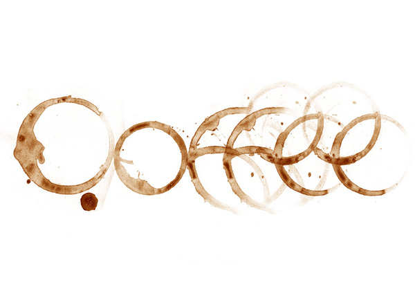
I like this ocean on as the ‘swirly’ parts on the end of the letters, look like waves, which come from oceans. The coffee and milk images are similar to the ocean one; the artists have used coffee stains to make the letters of coffee and milk to make the word milk.


The letters that make up the words hand made in this image have actually been hand made. It looks nice on a white background.
‘You are the sweetest girl I have ever met’ has been made up from sweets. It really stands out due to the colours. The techniques and ideas to use for the typography and the images are what make them so clever and artistic.


The typography in the images below is very bright. They fit in well with the themes of the products. For example, the one that says fresh juice is selling juice made from fresh fruit (which is shown on the juice stand and is very bright) so the word juice is very big and bright which matches the product it is trying to sell.
The image with the baguette on is also extremely colourful, the artist has used the colours from the image of the baguette for the writing. Although the words are in French, the image really stands out and catches viewers eye.
The stereo typography has been created really well in my opinion. The font and colours remind people of being in a club or at a disco and the word stereo makes them imagine music. This was created well.


I think this image has been made well. People notice that the G has some writing inside so they look at it again to try to figure out what it says. This is what artists/designers want to happen when choosing a typeface.

These images below are colourful. They stand out because they are bright. The alphabet ones are similar to what I used when I made my final poster, only I cut out many different ones and moved them around.


The images below are my favourite ones of the typography I have been looking at today. The reason I like these is because the fonts or typefaces are so simple but yet they both make up a picture or phrase, which means something to the viewers. The LIFE one; the word life consists of many words that people go through in their lives such as pride, pain and gratitude, so most people can relate to this image.
The HAPPINESS one; the words in this image say ‘happiness is something that we decide ourselves, there are a lot of reasons to be unhappy but we choose to be happy because it makes us feel alive’, these words make up a heart shape.
These images stood out the most to me because they had an image or a phrase, which meant something to me, and because of this, it made me look at what the words inside them said.


Different type affects different people. For my poster I wanted to have a type for everyone. I decided to use various letters from images on the web to create my title ‘organised babble’. I did this because it looks different to modern day rock band posters and brings back the 70’s style, and because each letter I used related to a different gender, age and race. The bands target audience is anyone so the poster should reflect this. Also, because each letter has a different font, size and colour it makes it a little confusing to read, so when people see the poster, they will look at it again and read it properly so they know what it says.
I am now going to create a questionnaire for product testing.
This is my questionnaire:
 I had to print off some photographs and posters so that the public could fill the surveys in so I placed various photos onto a photoshop document and printed them off. I numbered them so it was easier for and me to identify the photos the public talked about:


I will now ask my family and friends, people in my class and people around the college to fill in the questionnaires.
Thursday 30th June 2011
I found an article on www.wikihow.com, which explains to readers how to use different fonts on posters and the impact text has. (http://www.wikihow.com/Use-Different-Fonts-on-Your-Posters).
In the first paragraph it states that the main purpose of a poster is to catch peoples eyes, different styles of text can do this. The bigger, bolder and less boring the text is, the more people passing by will see the poster.
The article also says that on a poster, 1/3 of it is usually made up of text compared to 2/3 visuals, and the artist should use really bold, over the top fonts for the title or headline.
Also, try not to use too many fonts.
As I used many different fonts on my poster in a ransom note style, I looked at an article on http://en.wikipedia.org on ‘ransom note effect’ (http://en.wikipedia.org/wiki/Ransom_note_effect). It says that in typography, this effect uses a number of juxtaposed typefaces. This style of font came from the stereotypical ransom note in which the letter, sentence or phrase is made up of letters cut from newspapers or magazines to avoid using handwriting that is recognisable.
I took the idea from early 70’s rock band posters. There are some fonts that are in this style that I could have used, however, I wanted to create the title myself by cutting letters from different articles and images.
After annotating the articles above, I decided to find an article about how to create a poster, as that is what my Final Major Project is about.
I found one on the website http://www.wikihow.com/Create-and-Design-a-Poster. This article states that posters are the best way to get the message across and are simple and effective.
The article gives step-by-step guidance on how to create and design a poster. The first one tells the readers to plan what the poster will consist of, for example, what text and what images will be on the poster. Then you have to decide which particular fonts you will use and try to choose one that stands out.
Sketch designs for your poster to make sure the layout is nice and attractive before spending lots of time making it. The article tells the readers to change the positioning of the text and images to make it more readable and stand out more, make sure it grab’s the readers eye ‘by only a glimpse’.
Also, it says; scatter logos and images in the blank spaces but do not overpower the title, as it is the main priority.
Finally, ‘ask someone to see if the poster is effective and easy to understand’ or in my case, create questionnaires and ask people to fill them out.
I am now going to create a questionnaire for product testing.
This is my questionnaire:


I will now ask my family and friends, people in my class and people around the college to fill in the questionnaires.
Thursday 30th June 2011
Overall, I managed to get 23 respondents to the questionnaires. I created pies charts and bar charts in Microsoft Word to show my findings and the results of the surveys. In order to finish the pie charts I needed to find the percentages of how many people liked poster 1 and poster 2 (Which poster do you like the most?) and whether they likes the photographs I chose to use as my final ones (Do you like the photographs?). I made a bar chart for the questions; which individual photo do you like the most? And; which group photo do you like the most?


Here are the bigger versions of the charts so they are easier to read.


I found out that 43.47% of people preferred Poster 1 and 56.53% of the people who filled in the questionnaires liked Poster 2 the most. I also realised that out of 23 people, 12 of them said they liked all my photographs (52.17%), 8 said they liked most of them (34.78%), 13.05% said they liked some of them (3 out of 23) and 0 people said they liked none of them.


I found out that 43.47% of people preferred Poster 1 and 56.53% of the people who filled in the questionnaires liked Poster 2 the most. I also realised that out of 23 people, 12 of them said they liked all my photographs (52.17%), 8 said they liked most of them (34.78%), 13.05% said they liked some of them (3 out of 23) and 0 people said they liked none of them.
Of the individual photographs I used for my Final Major Project, the most liked was photo 2 and the least liked were photos 6 and 11. Photos 3, 8, 9 and 10 all got just 1 person liking them the most. Photograph 5 from the group photos was the most preferred with 9 people liking it. Photo 3 was the second most liked with 5 people, then 4 with 4 people, then photos 6 and 1 with 3 people liking it and the least liked was photo 2 with just one person that preferred it to the others.
The two questions that I used bar charts to show the findings of do not have the same amount of likes as the people filling in the questionnaires. This is because some respondents, when filling in the answer boxes for ‘which individual photo and which group photo do you like the most?’, chose more than one photo.
I think my questionnaire helped me to find out which type of photos the public liked the most and the style of poster, it also helped me to understand what I need to improve on for the future. However, I should have asked on the questionnaire what age and gender the respondents were as this would have helped me to find out what type of people like what style of photograph and poster.
Evaluation
![]()
![]()
![]()
![]()
![]()
Another said they liked the one of Kev the most as the like the brightness of the background and the black and white effect on the person.
![]()
And another said they liked the edited one of Buz the most as they liked the brightness of certain parts of the photo and that he looks like ‘a proper model’ the way he is sat.
![]()
![]()
![]()
Evaluation
When I first received the project brief for the final major project I felt very nervous but excited. It would give me the chance to meet new people and speak to real clients like a real business worker. I wasn’t sure what to do for my project but in the end decided to do a photo-shoot for the band organised babble and make a poster for them to advertise their websites and the places and dates of their future gigs.
I got to meet up with the band for the photo shoot, which was fun and although some of the photographs that were taken turned out to be blurry I still got some good useable shots that the band were pleased with.
After I had taken the photos I needed to edit some of them and decide which group one I would use for the poster. I edited them in Photoshop and used lots of different techniques and filters. Some of them I even cut up and made different faces out of them, and others I used to make a paintbrush with and painted the other band members. I really enjoyed doing this project.
I took the photos of the band at the Tudor House Hotel in Wigan then at a Church. The settings at the church were really nice; there were lots of lovely buildings and grass. I chose six final images of the band members individually and a group photo. I also chose some images I had edited.
Individual Photos
This is the best photograph I took of Emma, my client:
I like this photograph because she is not looking directly at the camera and the wind is blowing her hair so it looks very natural and nice. The blue background, orange top and black hat match the colour scheme.
One respondent to my questionnaires said that their favourite individual photo was this one because ‘it looks really natural and I like the wind blowing in her hair and the blue background’.


I think overall from all the photos I took, this one is my favourite. The leaves stand out a lot because of the colour and the photo looks very clean. The right hand side of the photo is a lot brighter because of the sun but overall I think it is a great photo.


I like this photograph because Buz’s eyes stand out. But the sun is a bright on the left hand side and he is getting something out of his pocket, which ruins the photo a little.

This photograph is of Mike, he personally didn’t like this photograph but the rest of the band and myself did so I decided to use it. The background is a little dark but I think this gives something extra to the photograph and makes it look nicer, especially because he has a white shirt on which stands out more because of the darkness of the background. It looks very natural and dramatic.


The band said that in the photos of Kev, he looked really young but I like this photograph. I think it needs editing a bit because of the sun and the bars to the left of him but it is an alright photograph.

This was probably the best photograph of Roy. Some turned out blurry and others were too bright due to the sun. He is smiling/laughing, which is what I love about this photo. Rather than him smiling into the camera because he is having a photo taken, he is just smiling naturally. This is a good photograph. However, the background could have been more plain or tidied up in Photoshop. One of the respondents to my questionnaire said that the reason they like this photo the most of the individual ones is because ‘he looks really relaxed and happy, this photo puts me in a happy mood and makes me smile when I look at it’.

Of all my final photos which I have previously edited, I think the black and white one of Emma is the best, I also like the one of Kev with the black and white effect on him but the background is really bright.
My class said that they like this photograph because she has a nice facial expression, it is close up and clear and they like the black and white effect.

I edited a photo of Mike, but only added a simple filter. One person said they liked this best of the edited photos because ‘it is funny’ and another said they liked it because ‘it tells me more about the person in the photo than the others do and it is the best composed’.

One of my class mates said they liked the edited photo of Damo the most because it looks very artistic. However, another said that it was not a good use of Photoshop.

Another said they liked the one of Kev the most as the like the brightness of the background and the black and white effect on the person.

And another said they liked the edited one of Buz the most as they liked the brightness of certain parts of the photo and that he looks like ‘a proper model’ the way he is sat.

The edited photo of Roy was one of my worst ones; the filter I used wasn’t very effective in making the photo stand out. It looks really dark and dull. One person that filled in one of my questionnaires said they liked this photo the most of all the individual edited photos, however, I disagree.


Group photos
I chose six group photos overall for my final pieces.
This photo is nice as the band are all just looking where they want to and some are not concentrating on the camera so it looks like they are thinking and being natural. One of my class mates said they like this photo because it is well composed and tells him a lot about the band.
On the other hand, one of the respondents said that I could have told the man in the middle of the bottom row (Roy) to move to the right a little so he was in the middle.
![]()

One person said they liked this photograph of the group the most as they like the random effects on the squares; it makes the band look like fun and a happy kind of band. However, some people said that I should have kept the squares on the photo unchanged and that it spoils the colour and quality. And one of the members of my class said that they didn’t like one of the effects on one of the squares so it ruined the whole photo.
![]()

These two photos are the same only the bottom one has been painted with an ‘organised babble’ paintbrush in Photoshop. Respondents to my questionnaire said they liked the first one as they liked the circle because it links the band together and makes viewers think they are all very close and a happy friendly band. And they said the liked the second one because they like the writing, and it looks very nice and artistic. One of my teachers said they really like this photo because it just shows what type of band they are, ‘I like the photo and how you have edited it, the words in the paintbrush cannot really be made out unless you look close and carefully, it just looks like babble, however, it has been organised to make the photo. There you go… its organised babble’
However, the sky is a little too bright so I should have edited it and maybe changed the brightness and contrast.
![]()
![]()


A popular group photo with the public was this one. They said it looks natural, it looks good, the background is attractive and they like the fact that the background is sunny and the foreground is shady; it gives off a nice affect.


One respondent said they like this photo because they like the background and it has a nice antique like effect. Although this is a really good set out photograph, the lighting is wrong, the brightness and contrast needs to be changed in order for it to be useable.


Posters
I disliked one of the posters I made so I didn’t use it. Even though I really liked the image I used on the front of it, it was really plain and boring and looked unprofessional.
Jacob Philpot who designed a Pink Floyd poster inspired me. Each letter in ‘Pink Floyd’ had a photo of their previous album covers inside. It looked really professional and very tidy and clean. I decided to do the same style for one of my posters; only I used photos that I had edited of the band at an earlier date. I coloured the outside of the letters in to make it look like a shadow, as they didn’t stand out enough. I really liked the idea of this poster and most of the photos in each letter had the colours of their colour scheme in. However, the letters did not stand out enough for the public and it was a little difficult to make out what the poster said.
The people who responded to my questionnaires that said they liked this poster the best said they liked it because; they like the pictures of the band that make up the band name organised babble and it doesn’t look as fussy as the other poster, it looks nice and simple. Also, they like the background colour and the layout, the images are interesting and ‘it has all the information I need but it also has the creative logo on it to bring across the band’.
However, they also said that the title could have been bolder and easier to read, the space could have been used more efficiently and I shouldn’t have left any blank spaces unless there was a good reason to. Also, I should have used the background from the second poster on this one.

My new poster consisted of different types of letters from various articles from the internet and a photo with the words organised babble all over the background. My class mates said they like how it looks, how I used different fonts, they like the work with the text and the brushed letters and it is easier to read than poster 1.
However, the L and the E in the title are pixelated so they need to be of a higher resolution. The websites and the dates could be in a larger font size, the photograph could have been blended in more with the background and more of the writing in the background could have been added behind the title. One class mate said this poster is a little fussy so I should have less on it.

Overall, most of the photos are useable but may not be up to professional standard. I like most of them and the people who responded to my questionnaire did too. One of the people who filled one is said ‘maybe you should of asked the band to chat instead so that they could express what the group is like more. Also, more funny pictures would have worked for me because I think organised babble has a comedic style rather than a serious style’, so I should have used different techniques when taking photographs of the band and maybe asked them to complete activities whilst taking the photos.
I have really enjoyed doing this project, my favourite part has been working as part of a team, meeting new people and having a client. My Photoshop skills and communication skills have developed throughout the project.
I have really enjoyed doing this project, my favourite part has been working as part of a team, meeting new people and having a client. My Photoshop skills and communication skills have developed throughout the project.